Halloween Forest – working process
- StudioNIB

- Oct 3, 2012
- 5 min read
Want to know how I brewed up the creepy artwork for Halloween Forest? The dark secrets of the forest are about to be revealed! It’s a long post so lock your doors, settle down with a cup of of your favourite brew, and read on, muwahahaha…..
Artwork for the wrap-around cover. The title was originally envisaged to cascade downwards between the branches
As every book is different, I always strive to approach each project with a clean slate, as if it’s the first I’ve ever illustrated. The materials I use are are fairly established, so it’s the way I approach the project, my response to the text that determines how the book will take shape. I dislike books where the illustrator slaps the same branded style on whatever manuscript they receive without adapting or exploring to harmonise with the world of the author. I always try to match my work to the tone of the text. Nevertheless, in terms of production technique I do have an established process for creating books and Halloween Forest is quite a typical example of this.
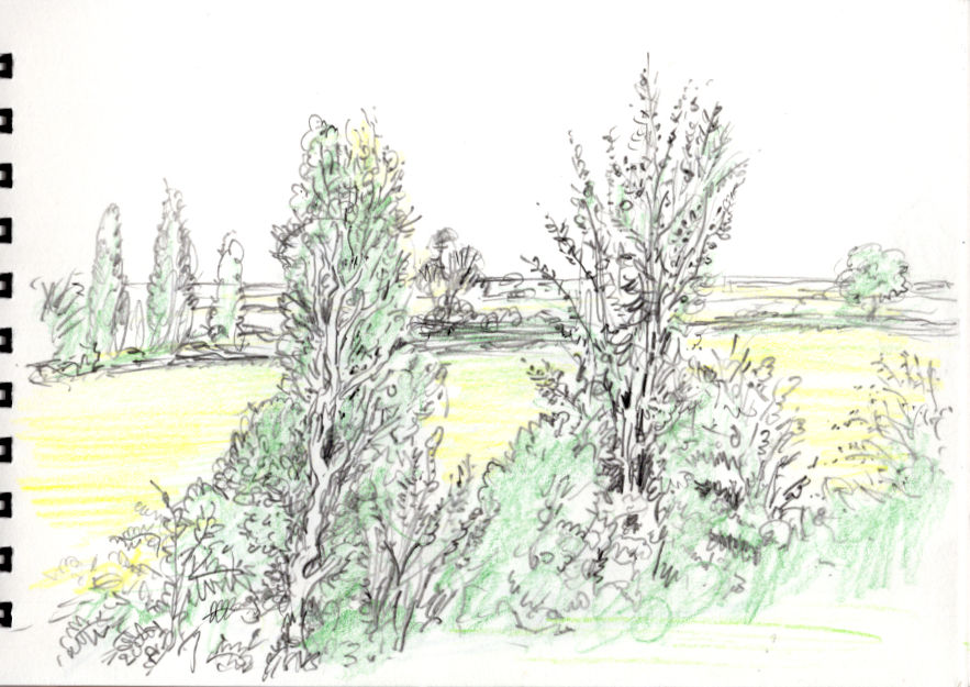
detail from page 16-17
In the case of a picture book written by another writer (as opposed to my own composition) the very first impressions are crucial, often the emotional impact of the first reading can form the germ of the final illustration. It’s important to get these ideas down on paper immediately, so before I began reading Marion Dane Bauer‘s text I made sure I had pen and pencil at hand for jotting. As I read, I noted page breaks (i.e. the natural point where text will roll onto the next page), and jotted down any ideas that immediately came to mind in tiny thumbnail shorthand on the same sheet, like so:
Raw text as received, with my initial notes
Deciding page breaks with Halloween Forest was quite straightforward because the book is in verse, each stanza roughly equated to either one page or one spread (double page) of the book.
Thumbnail jottings helped to establish some of the initial rough look of spreads. I have a cinematic way of planning images, I imagine the scene as if it were a stage, then consider a variety of poses or designs to find the best “camera angle”, lighting etc. Often a very elaborate illustration can grow from a tiny compositional note. I then turned to doodling in a sketch pad in pen to explore details suggested by the story, the look of the central character, and some of the visual conundrums created by the text, such as how to visualise a forest of bones.

sketchbook doodled ideas
With some ideas thus loosely established, I then started planning the book spreads by using a storyboard such as this, still keeping everything very rough and fluid:
32-page storyboard before starting on sketches
Each square represents a double page spread of a 32-page separate ended book (that is, a book that has separate paste-down endpapers). This allows me to plan the whole book out on one sheet, because everything is small and loose I can change things around easily, scrub out, redraw etc, without any major reworking involved. Often I use post-it notes to re-organise page breaks or move ideas around until I’m happy with the overall planning. I had five or six spreads already fixed in my mind, certain ‘crescendo’ spreads that would provide the foundations, I developed the remaining connecting spreads around them, looking to establish a rhythmic flow of images through the book.
With the basic planning fixed and ideas of the details in sketch books etc, I then began to draw more elaborate images for each picture in pencil on A4 size paper, one sheet representing a double page spread. These sketches, though larger than the thumbnails, are therefore still considerably smaller than the final artwork.
alternative idea for wrap-around cover (unused)
pencil sketch for the spread on pages 12-13
Pencil enables you to easily establish the tone of each picture, some images rely very much on drama created by shadows and highlight. This was a very exciting stage, as the book really began to take form, with details of line, depth and mood established.
Halloween Forest is undeniably a scary story for young children, but at the same time full of fun and rollicking energy. In the illustrations I aimed for a balance between spookiness and humour. The skeleton creatures crawling from the bone forest had to be convincing, but also attractive as characters. I was trying to create a warm glow of acceptable Halloween fright in the reader, finding the right level between scary but not truely frightening was a delicate challenge.
From the town to the forest, sketch for spread on pages 8-9
finished art for spread on pages 8-9
Once the whole book was drawn out I scanned each sketch, then in Photoshop and In Design darkened the lines, tweaked proportions, added text where necessary, and emailed the whole dummy book to the art director as a pdf file. The publishers are in America, I was in rural England, but we could have been next door to each other, ah! the wonders of technology. There were a few editorial revisions, most importantly to the last climactic pages, where it was felt there needed to be a house at the heart of the forest as the character is going trick-or-treating. So I dropped one image, adapted and brought another forward one page, and drew a new final spread of a house for page 30-31 (more on which below). Thereafter the book was given approval and I could begin on the final artwork.
cancelled image – this sketch was dropped and text rearranged so I could fit in a house spread at the end of the book
Using a photocopier, I enlarged copies of the sketches to the final size of the book. Often I work at 115% or 120%, that is to say the artwork is slightly larger than reproduction size of the book, which helps to sharpen definition of detail when it’s reduced for printing. The full sized photocopies were then traced in pencil onto watercolour paper using a light box. Finally I was ready to begin inking and painting the illustrations.
Halloween Forest was a very intuitive book which flowed very smoothly, the drawings were straight out of my imagination with very little research, however for reference and to give me a real feel for the subject I looked at a lot of photos of animal bones, which were a great inspiration as well as providing direct reference, though I don’t claim that every skeleton is anatomically correct!

Many of the characters were a balance between visual accuracy, fluidity of image, and animated character.
Detail from page 22, I foolishly drew this little bird right across the trim so it was unfortunately cropped in the printed book!
Not every spread is of the forest and bones. At key points of drama I included colourful graphic images designed to jolt the reader and emphasise a turn in the narrative, in these spreads in particular I could play with font layout. As the text was laid out by the designer I gave directions in the sketches as to how I envisaged the words should appear, the design team did a wonderful job in following through with this.
spread on pages 20-21 from the printed book
ditto, pages 24-25
Finally, to show the progression of a single illustration here’s a series of images of the last climatic spread on page 30-31 in the process of creation.
part way through inking with india ink
completed pen and ink drawing before colouring
at work on watercolour
Individual sections of tree were back-filled in two colours and water, which is why I’m holding multiple brushes.
defining sepia edges on the skull house
filling in the door
The painting in watercolour almost there
And finally, voila! The completed illustration.


Comments