Inktober 2019 – The first 15 drawings

Inktober 2019 Day 1, and the prompt word was: RING
It’s that time of year again, and once more I entered the maelstrom of feverish scribbling that is Inktober. Here are the first fifteen of my daily drawings (Days 16-31 to follow).
Day 2, prompt word: MINDLESS
If you’ve not heard of Inktober before, it’s a social media challenge, where participants create and post online a drawing made in ink (of whatever kind), one a day throughout the month of October, using the hashtags “Inktober” and “Inktober2019”. Artists are free to draw whatever they like, but some choose specific themes to work on, or follow the official list of prompt words (there are also several non-official prompt lists).
Bear Baiting. Day 3, and the prompt word was: BAIT
Personally I like the challenge of the official prompt list, not because I’m particularly inspired by the words, which can sometimes appear rather lumbering on face reading, the challenge is finding a way to fit the word with an illustration that digs beneath the obvious, that is both personal and coherent. And if you can add layers that respond to the prompt word on multiple levels all the better. The interesting challenge of Inktober is as much about ideas and interpretation as it is about drawing.
Frozen. Winter is coming folks, people need our help. This was inspired by a guy who regularly sits out on a pedestrian bridge near where I live. I’ve not seen him for a while now though, I hope he’s okey. Day 4’s prompt word: FREEZE
This year I drew everything using the same pen, no experimenting with various tools. That’s probably something to do with a certain degree of chaos at the moment – there’s a lot going on this month in the household – dummy submissions, major building work on my house, volunteer commitments with SCBWI and so on, Inktober was squeezed in between these, I wouldn’t say I was particularly relaxed during this process! And that’s all on top of all the chaos in the news…
Day 5: BUILD. (an allegory of our times)
All the drawings were made without pre-October preparation, no drawings pulled out of the stock draw or created/planned ahead. I looked at the word on each morning, considered what I would draw during the day, and drew it in the evening, sometimes later. Twice I fell behind a day, it happens, but managed to catch up before the end of the month.
Day 6: HUSKY. I’ve been listening to a lot of smokey old jazz recently
These are rather different from commissioned drawings – more about a meandering flow of ideas, somehow the constraints of illustration briefs can place barriers on the way we approach work. If I think – oh, this is for publication! It becomes a task, a job. Inktober is great, because although the task is still there, I don’t feel the pressure of professional requirements to closely match a brief, there is a theme, but so much freedom to express and explore.
Day 7: ENCHANTED. By the time I posted the drawing the clock had turned midnight, but no matter, as they say, he who pays the piper calls the tune.
It has been suggested I “do something” with these drawings – perhaps publish them in a book? A colouring book perhaps? Or perhaps sell them as prints? I’d need to test the market for that, do get in touch if you’re interested! – I have a LOT of black & white drawings, most of which just sit in sketchbooks or otherwise gathering dust, I’m not very good at merchandising/selling my work to the general public outside the parameters of the illustration business. I once started, but quietly abandoned an Etsy shop, I’m not a great shopkeeper for my own work, something I need to look at more carefully!
Day 8: FRAIL
Also, as my Inktober drawings are fundamentally sketches I’d want to redraw some much more neatly if I were to sell them – but then of course they’d lose their immediacy. You always sacrifice something when you take a vigorous sketch and redraw it precisely, it’s like caging a wild animal.
Day 9: SWING
Day 10: PATTERN
Day 11: SNOW. A very simple one this day, as I was up very early for a London trip in the morning.
Day 12: DRAGON. Drawn on the train to London.
Day 13: ASH. Aschenputtel is the German version of Cinderella, recorded in the Grimm Brothers’ Household Tales in 1812.
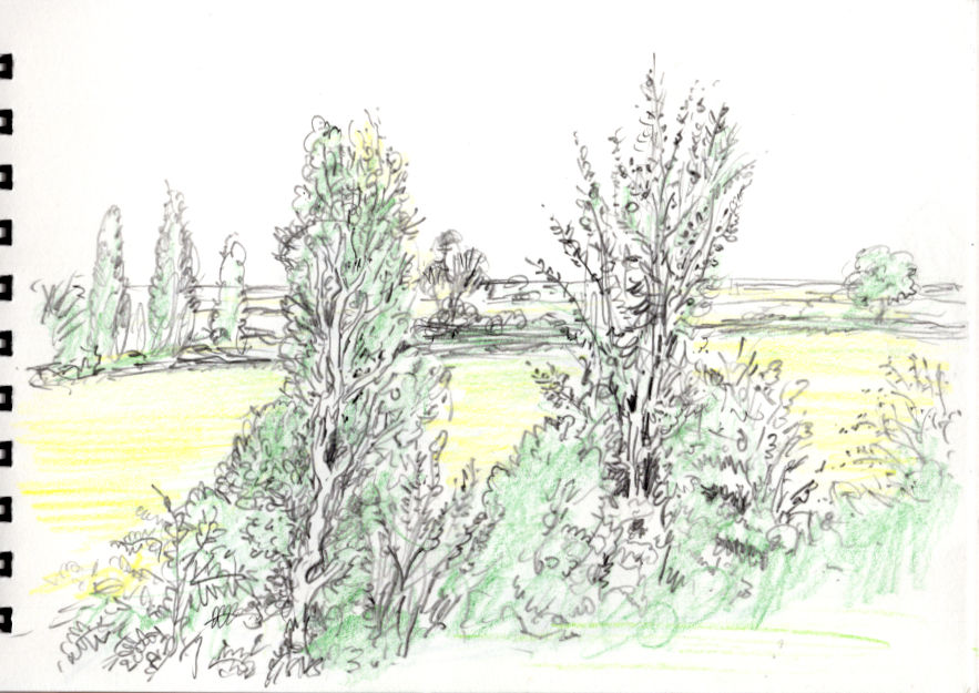
Day 14: OVERGROWN. This is one of those drawings that kind of took on a life of it’s own.
Day 15: LEGEND. The table is based on the historic medieval round table preserved in Winchester, where coincidentally SCBWI is holding it’s Annual Conference in early November.
So what next? I’m considering carrying on doing daily drawings, maybe after a short break! Will I do it next year? Well, who knows! More pictures on the way from the second part of the month in the next post…


https://afunbono.mx/es-mx/registrarse-en-afun/ entré un rato para ver qué tal y la verdad es que va al grano. Me gustó que desde el inicio te dicen qué cosas básicas te van a pedir para el alta, sobre todo lo del usuario/contraseña y el tema del móvil con su verificación, así no te quedas a medias buscando qué falta. También se nota que cuidan el tema de seguridad, porque recalcan lo de armar una contraseña decente (mínimo con mezcla de letras y números) y no usar la misma de siempre. No me puse a leer todo con lupa, pero la info está fácil de escanear y no se siente como un muro de texto. Se ve bien organizado con bloques cortos y títulos…
tỷ lệ kèo nhà cái thì đúng là nằm chình ình trên trang, kiểu “khỏi hỏi nữa nhé” nên nhìn cái là biết họ ưu tiên phần gì rồi. Mình lướt qua cho vui thôi mà thấy cách họ trình bày theo dạng bảng khá ổn, hàng cột thẳng, mắt không phải chạy vòng vòng như mấy trang toàn chữ với chữ; thỉnh thoảng kéo xuống còn thấy số liệu thay đổi liên tục, trông giống bảng điểm đang cập nhật hơn là bài viết kể lể. Có mấy mục nội dung đặt tiêu đề rõ ràng kiểu kèo nửa trận toàn trận hay 2 đội ghi bàn, bấm vào là ra đúng thứ mình cần, không phải đọc mở…
jd88 vip mình cũng chỉ ghé thử vì thấy bạn bè nhắc hoài, kiểu tò mò xem giao diện ra sao. Vào cái là thấy trang bố cục khá thoáng, nội dung chia thành từng khối nhìn phát hiểu ngay chỗ nào là thông tin chính, không phải căng mắt đọc. Mình lướt nhanh thôi chứ không đào sâu, nhưng cảm giác điều hướng ổn: menu để khá dễ thấy nên bấm qua lại không bị lạc hay phải tìm. Mấy phần hiển thị dạng bảng cột nhìn gọn, chữ vừa phải nên đọc đỡ mỏi. Nói chung trải nghiệm kiểu nhẹ nhàng, không rối rắm như vài trang khác mình từng xem, nhất là cách họ chia khối nội…
https://kjcpro.it.com/ hôm trước mình thấy bạn bè nhắc nhiều quá nên bấm vào xem thử cho biết. Mình cũng không đọc sâu đâu, chủ yếu lướt giao diện với cách họ trình bày nội dung thôi. Cảm giác đầu tiên là trang làm khá gọn, chia khối rõ ràng nên nhìn không bị rối mắt. Có đoạn họ nhắc tới mấy tiêu chí kiểu minh bạch/bảo mật khá nghiêm ngặt, đọc lướt vẫn hiểu họ đang muốn nói về chuẩn kiểm tra của “liên minh” này. Mình thích kiểu tiêu đề đặt dễ thấy, kéo xuống là gặp các box thông tin xếp thẳng hàng, nhìn sạch sẽ và theo dõi nhanh, nhất là phần nội dung chia theo từng…